|
|
| (30 intermediate revisions by 2 users not shown) |
| Line 1: |
Line 1: |
| /* ==========================================================
| | __NOTOC__ |
| EKOLOGOS WIKI DESIGN SYSTEM v2.0
| | <div class="eko-hero"> |
| Foundation
| |
| ========================================================== */
| |
|
| |
|
| /* ==========================================================
| | <div class="eko-overlay"></div> |
| 1. ROOT VARIABLES
| |
| ========================================================== */
| |
|
| |
|
| :root{
| | <div class="eko-content"> |
|
| |
|
| --eko-green:#23492F;
| | <h1 class="hero-title-main"> |
| --eko-accent:#295536;
| | Ecological Knowledge |
| --eko-bg:#F8F6F1;
| | </h1> |
| --eko-white:#ffffff;
| |
| --eko-text:#333333;
| |
| --eko-light:#666666;
| |
|
| |
|
| --radius:18px;
| | <h2 class="hero-title-sub"> |
| | Across Cultures and Landscapes |
| | </h2> |
|
| |
|
| --shadow-sm:0 6px 18px rgba(0,0,0,.08);
| | <p> |
| --shadow-md:0 12px 30px rgba(0,0,0,.10);
| | A collaborative knowledge commons documenting ecological knowledge, |
| --shadow-lg:0 22px 50px rgba(0,0,0,.15);
| | environmental change, biodiversity, and culture across the world. |
| | </p> |
|
| |
|
| --container:1280px; | | </div> |
|
| |
|
| }
| | </div> |
| | <div class="homepage-section"> |
|
| |
|
| /* ==========================================================
| | <div class="section-header"> |
| 2. GLOBAL
| |
| ========================================================== */
| |
|
| |
|
| html{
| | <div class="section-title-left">[[File:Globe.png|22px|link=|alt=Globe]]<div class="section-heading">Explore by Region</div></div> |
| scroll-behavior:smooth;
| |
| }
| |
|
| |
|
| body{
| | <div class="section-title-right">[[Regions|Browse all regions →]] <span class="dev-inline-badge">In development</span></div> |
| margin:0;
| |
| padding:0;
| |
| background:var(--eko-bg);
| |
| color:var(--eko-text);
| |
| font-family:"Segoe UI",Roboto,Arial,sans-serif;
| |
| }
| |
|
| |
|
| /* ========================================================== | | </div> |
| FULL WIDTH LAYOUT
| |
| ========================================================== */
| |
|
| |
|
| body .container,
| |
| body .container-fluid,
| |
| .col-cmln,
| |
| .col-12,
| |
| #mw-content-text,
| |
| .page-Main_Page .mw-parser-output{
| |
|
| |
|
| width:100% !important; | | <div class="homepage-grid"> |
| max-width:100% !important;
| |
|
| |
|
| }
| | <div class="eko-card"> |
| | <div class="dev-badge">In development</div> |
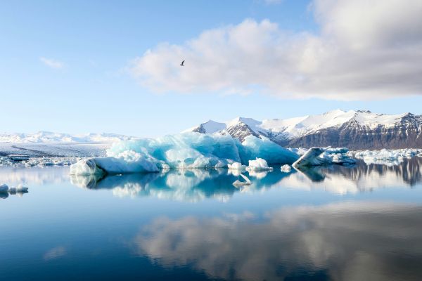
| | [[File:Arctic.jpg|600px|link=Arctic & Sápmi]] |
| | <div class="eko-card-body"> |
| | <h3 class="eko-card-title">Arctic & Sápmi</h3> |
| | </div> |
| | </div> |
|
| |
|
| .page-Main_Page .container{
| | <div class="eko-card"> |
| width:100% !important;
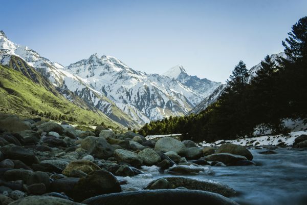
| | [[File:Himalayas.jpg|600px|link=Nagaland & Indo–Myanmar Highlands]] |
| max-width:100% !important;
| | <div class="eko-card-body"> |
| margin:0 !important;
| | <h3 class="eko-card-title">Nagaland & Indo–Myanmar Highlands</h3> |
| padding:0 !important;
| | </div> |
| }
| | </div> |
|
| |
|
| .page-Main_Page .flex-fill.container{
| | <div class="eko-card"> |
| width:100% !important;
| | <div class="dev-badge">In development</div> |
| max-width:100% !important;
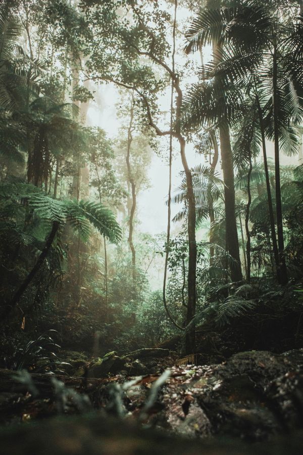
| | [[File:Amazonia.jpg|600px|link=Amazonia & Brazil]] |
| margin:0 !important;
| | <div class="eko-card-body"> |
| padding:0 !important;
| | <h3 class="eko-card-title">Amazonia & Brazil</h3> |
| }
| | </div> |
| | </div> |
|
| |
|
| .page-Main_Page #content,
| | <div class="eko-card"> |
| .page-Main_Page #bodyContent,
| | <div class="dev-badge">In development</div> |
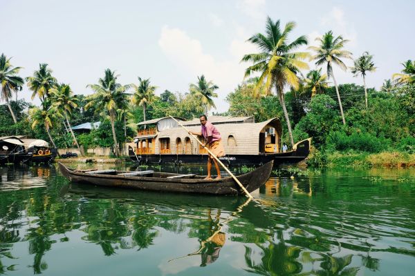
| .page-Main_Page #mw-content-text, | | [[File:South India.jpg|600px|link=Bengaluru & South India]] |
| .page-Main_Page .mw-parser-output{
| | <div class="eko-card-body"> |
| | <h3 class="eko-card-title">Bengaluru & South India</h3> |
| | </div> |
| | </div> |
|
| |
|
| margin:0 !important; | | </div> |
| padding:0 !important;
| |
|
| |
|
| }
| | </div> |
|
| |
|
| /* ==========================================================
| |
| CONTENT PAGES
| |
| ========================================================== */
| |
|
| |
|
| body:not(.page-Main_Page) .mw-parser-output{
| | <div class="theme-section"> |
|
| |
|
| max-width:1100px; | | <div class="theme-header"> |
| margin:auto;
| |
| padding:40px 30px;
| |
|
| |
|
| }
| | <div class="theme-title-left">[[File:Biodiversity.png|22px|link=|alt=Theme]]<div class="theme-heading">Explore by Theme</div></div> |
|
| |
|
| /* ==========================================================
| | <div class="theme-title-right"> |
| MAIN PAGE CLEANUP
| | [[Themes|Browse all themes →]] <span class="dev-inline-badge">In development</span> |
| ========================================================== */
| | </div> |
|
| |
|
| .page-Main_Page #firstHeading,
| | </div> |
| .page-Main_Page #contentSub,
| |
| .page-Main_Page #toc,
| |
| .page-Main_Page .page-tools,
| |
| .page-Main_Page .mw-indicators{
| |
|
| |
|
| display:none !important;
| |
|
| |
|
| }
| | <div class="theme-grid"> |
|
| |
|
| /* ==========================================================
| | <div class="theme-card"> |
| NAVBAR
| | <div class="dev-badge">In development</div> |
| ========================================================== */
| | <div class="theme-icon">[[File:Climate-change.png|52px|link=Climate & Environmental Change|alt=Climate & Environmental Change]]</div> |
| | <div class="theme-name">Climate &<br>Environmental Change</div> |
| | </div> |
|
| |
|
| .page-Main_Page .navbar{ | | <div class="theme-card"> |
| | <div class="dev-badge">In development</div> |
| | <div class="theme-icon">[[File:Agriculture.png|52px|link=Food, Farming & Cultivation|alt=Food, Farming & Cultivation]]</div> |
| | <div class="theme-name">Food, Farming &<br>Cultivation</div> |
| | </div> |
|
| |
|
| position:absolute;
| | <div class="theme-card"> |
| top:0;
| | <div class="dev-badge">In development</div> |
| left:0;
| | <div class="theme-icon">[[File:Water-systems.png|52px|link=Water, Rivers, Ice & Oceans|alt=Water, Rivers, Ice & Oceans]]</div> |
| right:0;
| | <div class="theme-name">Water, Rivers,<br>Ice & Oceans</div> |
| | </div> |
|
| |
|
| z-index:1000;
| | <div class="theme-card"> |
| | <div class="dev-badge">In development</div> |
| | <div class="theme-icon">[[File:Forest-knowledge.png|52px|link=Forests, Land & Biodiversity|alt=Forests, Land & Biodiversity]]</div> |
| | <div class="theme-name">Forests, Land &<br>Biodiversity</div> |
| | </div> |
|
| |
|
| background:transparent !important;
| | <div class="theme-card"> |
| border:none !important;
| | <div class="dev-badge">In development</div> |
| box-shadow:none !important;
| | <div class="theme-icon">[[File:Traditional-medicine.png|52px|link=Plants, Healing & Health|alt=Plants, Healing & Health]]</div> |
| | <div class="theme-name">Plants, Healing<br>& Health</div> |
| | </div> |
|
| |
|
| }
| | <div class="theme-card"> |
| | <div class="dev-badge">In development</div> |
| | <div class="theme-icon">[[File:Animal-relations.png|52px|link=Animals & Multispecies Relations|alt=Animals & Multispecies Relations]]</div> |
| | <div class="theme-name">Animals &<br>Multispecies Relations</div> |
| | </div> |
|
| |
|
| /* Logo */ | | <div class="theme-card"> |
| | <div class="dev-badge">In development</div> |
| | <div class="theme-icon">[[File:Dreams-cosmologies.png|52px|link=Memory, Storytelling & Cosmology|alt=Memory, Storytelling & Cosmology]]</div> |
| | <div class="theme-name">Memory, Storytelling<br>& Cosmology</div> |
| | </div> |
|
| |
|
| .navbar-brand{ | | <div class="theme-card"> |
| | <div class="dev-badge">In development</div> |
| | <div class="theme-icon">[[File:Fire-land-management.png|52px|link=Environmental Justice & Political Ecology|alt=Environmental Justice & Political Ecology]]</div> |
| | <div class="theme-name">Environmental Justice<br>& Political Ecology</div> |
| | </div> |
|
| |
|
| display:flex !important;
| | <div class="theme-card"> |
| align-items:flex-start !important;
| | <div class="dev-badge">In development</div> |
| justify-content:center;
| | <div class="theme-icon" style="font-size:40px; line-height:52px; color:#356247;">✦</div> |
| | <div class="theme-name">Methods, Media &<br>Environmental Pedagogy</div> |
| | </div> |
|
| |
|
| height:70px; | | </div> |
|
| |
|
| padding:0 8px !important;
| | </div> |
| margin-top:-50px;
| |
|
| |
|
| }
| | <div class="collections-section"> |
|
| |
|
| .navbar-brand img,
| | <div class="collections-heading">Featured Knowledge Collections</div> |
| .navbar-brand .mw-wiki-logo,
| |
| #p-logo img{
| |
|
| |
|
| display:block;
| | <div class="collections-grid"> |
|
| |
|
| height:90px;
| | <div class="collection-card"> |
| width:auto;
| | <div class="dev-badge">In development</div> |
| | <div class="collection-image">[[File:Indigenous Ecological Knowledge.jpg|700px|link=Indigenous Ecological Knowledge|alt=Indigenous Ecological Knowledge]]</div> |
| | <div class="collection-body"> |
| | <div class="collection-title">[[Indigenous Ecological Knowledge]]</div> |
| | <div class="collection-text">Traditional systems of environmental observation, stewardship, and adaptation.</div> |
| | </div> |
| | </div> |
|
| |
|
| }
| | <div class="collection-card"> |
| | <div class="dev-badge">In development</div> |
| | <div class="collection-image">[[File:Environmental Change.jpg|700px|link=Environmental Change|alt=Environmental Change]]</div> |
| | <div class="collection-body"> |
| | <div class="collection-title">[[Environmental Change]]</div> |
| | <div class="collection-text">Historical and contemporary accounts of ecological transformation.</div> |
| | </div> |
| | </div> |
|
| |
|
| /* Navigation */ | | <div class="collection-card"> |
| | <div class="dev-badge">In development</div> |
| | <div class="collection-image">[[File:Atlas of Ecological Knowledge.jpg|700px|link=Atlas of Ecological Knowledge|alt=Atlas of Ecological Knowledge]]</div> |
| | <div class="collection-body"> |
| | <div class="collection-title">[[Atlas of Ecological Knowledge]]</div> |
| | <div class="collection-text">Interactive maps connecting places, species, stories, and communities.</div> |
| | </div> |
| | </div> |
|
| |
|
| .page-Main_Page .navbar-nav>li>a{ | | <div class="collection-card"> |
| | <div class="dev-badge">In development</div> |
| | <div class="collection-image">[[File:Biodiversity Archive.jpg|700px|link=Biodiversity Archive|alt=Biodiversity Archive]]</div> |
| | <div class="collection-body"> |
| | <div class="collection-title">[[Biodiversity Archive]]</div> |
| | <div class="collection-text">Species accounts, habitats, and community-based observations from around the world.</div> |
| | </div> |
| | </div> |
|
| |
|
| color:#ffffff !important;
| | </div> |
| font-weight:500;
| |
|
| |
|
| }
| | </div> |
|
| |
|
| .page-Main_Page .navbar-nav>li>a:hover{
| | <div class="home-lower-section"> |
|
| |
|
| color:#d8ead8 !important;
| | <div class="home-upper-grid"> |
|
| |
|
| }
| | <div class="home-articles-panel"> |
| /* ==========================================================
| |
| HERO
| |
| ========================================================== */
| |
|
| |
|
| .eko-hero{
| | <div class="home-lower-heading">Featured Articles</div> |
|
| |
|
| position:relative;
| | <div class="home-articles-grid"> |
|
| |
|
| width:100%;
| | <div class="home-article-item"> |
| | <div class="home-article-thumb">[[File:sami-reindeer-herding.png|48px|link=Sami Reindeer Herding|alt=Sami Reindeer Herding]]</div> |
| | <div class="home-article-copy"> |
| | <div class="home-article-title">[[Sami Reindeer Herding|Sámi Reindeer Herding]] <span class="dev-inline-badge dev-article-badge">In development</span></div> |
| | <div class="home-article-place">Arctic</div> |
| | </div> |
| | </div> |
|
| |
|
| min-height:720px;
| | <div class="home-article-item"> |
| height:80vh;
| | <div class="home-article-thumb">[[File:himalayan-medicinal-plants.png|48px|link=Himalayan Medicinal Plants|alt=Himalayan Medicinal Plants]]</div> |
| max-height:900px;
| | <div class="home-article-copy"> |
| | <div class="home-article-title">[[Himalayan Medicinal Plants]] <span class="dev-inline-badge dev-article-badge">In development</span></div> |
| | <div class="home-article-place">Himalayas</div> |
| | </div> |
| | </div> |
|
| |
|
| background:
| | <div class="home-article-item"> |
| linear-gradient(rgba(0,0,0,.35),rgba(0,0,0,.35)),
| | <div class="home-article-thumb">[[File:naga-forest-conservation.png|48px|link=Naga Forest Conservation|alt=Naga Forest Conservation]]</div> |
| url("/wiki/images/2/26/Hero.jpg?20260703054727");
| | <div class="home-article-copy"> |
| | <div class="home-article-title">[[Naga Forest Conservation]] <span class="dev-inline-badge dev-article-badge">In development</span></div> |
| | <div class="home-article-place">Northeast India</div> |
| | </div> |
| | </div> |
|
| |
|
| background-size:cover;
| | <div class="home-article-item"> |
| background-position:center;
| | <div class="home-article-thumb">[[File:arctic-sea-ice-observation.png|48px|link=Arctic Sea Ice Observation|alt=Arctic Sea Ice Observation]]</div> |
| background-repeat:no-repeat;
| | <div class="home-article-copy"> |
| | <div class="home-article-title">[[Arctic Sea Ice Observation]] <span class="dev-inline-badge dev-article-badge">In development</span></div> |
| | <div class="home-article-place">Arctic</div> |
| | </div> |
| | </div> |
|
| |
|
| display:flex;
| | <div class="home-article-item"> |
| justify-content:center;
| | <div class="home-article-thumb">[[File:guarani-atlantic-forest-knowledge.png|48px|link=Guarani Atlantic Forest Knowledge|alt=Guarani Atlantic Forest Knowledge]]</div> |
| align-items:center;
| | <div class="home-article-copy"> |
| text-align:center;
| | <div class="home-article-title">[[Guarani Atlantic Forest Knowledge]] <span class="dev-inline-badge dev-article-badge">In development</span></div> |
| | <div class="home-article-place">Brazil</div> |
| | </div> |
| | </div> |
|
| |
|
| overflow:hidden;
| | <div class="home-article-item"> |
| | <div class="home-article-thumb">[[File:traditional-fire-management.png|48px|link=Traditional Fire Management|alt=Traditional Fire Management]]</div> |
| | <div class="home-article-copy"> |
| | <div class="home-article-title">[[Traditional Fire Management]] <span class="dev-inline-badge dev-article-badge">In development</span></div> |
| | <div class="home-article-place">Australia</div> |
| | </div> |
| | </div> |
|
| |
|
| }
| | </div> |
|
| |
|
| .eko-overlay{
| | <div class="home-browse-articles">[[Articles|Browse all articles →]] <span class="dev-inline-badge">In development</span></div> |
|
| |
|
| position:absolute;
| | </div> |
| inset:0;
| |
| background:rgba(0,0,0,.30);
| |
|
| |
|
| }
| |
|
| |
|
| .eko-content{
| | <div class="home-community-card"> |
|
| |
|
| position:relative;
| | <div class="home-community-title"> |
| z-index:2;
| | <span class="home-community-symbol">♧</span> |
| | Communities & Contributors |
| | </div> |
|
| |
|
| width:100%;
| | <div class="home-community-text"> |
| max-width:950px;
| | Researchers, students, elders, community knowledge holders, artists, and educators contribute to Ekologos. |
| | </div> |
|
| |
|
| padding:0 30px;
| | <div class="home-community-people"> |
| | <span>♙</span> |
| | <span>♙</span> |
| | <span>♙</span> |
| | <span>♙</span> |
| | <span>♙</span> |
| | <span>♙</span> |
| | </div> |
|
| |
|
| }
| | <div class="home-community-button"> |
| | [[Contribute|Contribute to Ekologos Wiki]] <span class="dev-inline-badge">In development</span> |
| | </div> |
|
| |
|
| /* ========================================== | | </div> |
| HERO TYPOGRAPHY
| |
| ========================================== */
| |
|
| |
|
| .hero-title-main{
| | </div> |
|
| |
|
| font-family:Georgia,"Times New Roman",serif;
| |
| font-size:78px;
| |
| font-weight:700;
| |
| line-height:1;
| |
| color:#ffffff;
| |
|
| |
|
| margin:0 0 14px;
| | <div class="home-about-project"> |
|
| |
|
| }
| | <div class="home-about-box"> |
|
| |
|
| .hero-title-sub{
| | <div class="home-info-icon">[[File:Biodiversity.png|70px|link=|alt=About Ekologos Wiki]]</div> |
|
| |
|
| font-family:Georgia,"Times New Roman",serif;
| | <div class="home-info-content"> |
| font-size:52px;
| |
| font-weight:500;
| |
| line-height:1.15;
| |
| color:#ffffff;
| |
|
| |
|
| margin:0 0 28px;
| | <div class="home-info-title">About Ekologos Wiki</div> |
|
| |
|
| }
| | <div class="home-info-text"> |
| | Ekologos Wiki is an open, collaborative platform for sharing and learning from ecological knowledge across cultures and landscapes. Our mission is to support respectful exchange, safeguard diverse knowledge traditions, and inspire care for the living world. |
| | </div> |
|
| |
|
| /* Single divider BELOW H2 only */
| | <div class="home-info-link"> |
| .hero-title-sub::after{
| | [[About|Learn more about Ekologos Wiki →]] <span class="dev-inline-badge">In development</span> |
| | </div> |
|
| |
|
| content:"";
| | </div> |
|
| |
|
| display:block;
| | </div> |
|
| |
|
| width:420px;
| |
| max-width:100%;
| |
|
| |
|
| height:1px;
| | <div class="home-project-box"> |
|
| |
|
| margin:28px auto 0;
| | <div class="home-info-icon">[[File:Ekologos-logo.png|70px|link=|alt=The Ekologos Project]]</div> |
|
| |
|
| background:rgba(255,255,255,.75);
| | <div class="home-info-content"> |
|
| |
|
| }
| | <div class="home-info-title">The Ekologos Project</div> |
|
| |
|
| /* Remove any divider after H1 */
| | <div class="home-info-text"> |
| .hero-title-main::after{ | | The Ekologos Wiki emerged from the Global Environmental Humanities Project and was developed through partnerships in Norway, India, Brazil, and beyond. |
| | </div> |
|
| |
|
| content:none;
| | <div class="home-info-link"> |
| | [[Ekologos Project|Visit the Project Portal →]] <span class="dev-inline-badge">In development</span> |
| | </div> |
|
| |
|
| }
| | </div> |
|
| |
|
| .eko-content p{
| | </div> |
|
| |
|
| max-width:760px;
| | </div> |
|
| |
|
| margin:35px auto 0;
| |
|
| |
|
| font-size:22px;
| | <div class="home-footer"> |
| line-height:1.7;
| |
|
| |
|
| color:rgba(255,255,255,.95);
| | <div class="home-footer-brand"> |
| | [[File:Ekologos-logo.png|42px|link=Main Page|alt=Ekologos Wiki]] |
| | <div class="home-footer-brand-text"> |
| | <div class="home-footer-brand-main">EKOLOGOS</div> |
| | <div class="home-footer-brand-small">WIKI</div> |
| | </div> |
| | </div> |
|
| |
|
| }
| | <div class="home-footer-links"> |
| /* Remove MediaWiki heading borders inside hero */ | | <span class="dev-footer-item">[[About]] <span class="dev-inline-badge dev-footer-badge">In development</span></span> |
| | <span class="dev-footer-item">[[Editorial Principles]] <span class="dev-inline-badge dev-footer-badge">In development</span></span> |
| | <span class="dev-footer-item">[[Knowledge Governance]] <span class="dev-inline-badge dev-footer-badge">In development</span></span> |
| | <span class="dev-footer-item">[[Contribute|How to Contribute]] <span class="dev-inline-badge dev-footer-badge">In development</span></span> |
| | <span class="dev-footer-item">[[Community Guidelines]] <span class="dev-inline-badge dev-footer-badge">In development</span></span> |
| | <span class="dev-footer-item">[[Rights & Reuse]] <span class="dev-inline-badge dev-footer-badge">In development</span></span> |
| | <span class="dev-footer-item">[[Contact]] <span class="dev-inline-badge dev-footer-badge">In development</span></span> |
| | <span class="dev-footer-item">[[Privacy policy|Privacy]] <span class="dev-inline-badge dev-footer-badge">In development</span></span> |
| | </div> |
|
| |
|
| .eko-content h1,
| | <div class="home-footer-social"> |
| .eko-content h2{
| | <span>f</span> |
| border: none !important;
| | <span>◎</span> |
| border-bottom: none !important;
| | <span>▶</span> |
| box-shadow: none !important;
| | </div> |
| text-decoration: none !important;
| |
| padding-bottom: 0 !important;
| |
| }
| |
|
| |
|
| .eko-content .mw-heading,
| | </div> |
| .eko-content .mw-heading1,
| |
| .eko-content .mw-heading2{
| |
| border: none !important;
| |
| border-bottom: none !important;
| |
| box-shadow: none !important;
| |
| margin: 0 !important;
| |
| padding: 0 !important;
| |
| }
| |
|
| |
|
| /* Keep only one divider below H2 */ | | </div> |
| | |
| .hero-title-sub::after{
| |
| content:"";
| |
| display:block;
| |
| width:420px;
| |
| max-width:100%;
| |
| height:1px;
| |
| background:rgba(255,255,255,.75);
| |
| margin:28px auto 0;
| |
| }
| |
| /* ==========================================================
| |
| HOMEPAGE SECTION
| |
| ========================================================== */
| |
| | |
| .homepage-section{
| |
| | |
| max-width:var(--container);
| |
| margin:0 auto;
| |
| padding:90px 40px;
| |
| | |
| }
| |
| | |
| /* ==========================================================
| |
| SECTION HEADER
| |
| ========================================================== */
| |
| | |
| .section-header{
| |
| | |
| display:flex;
| |
| justify-content:space-between;
| |
| align-items:center;
| |
| | |
| width:100%;
| |
| | |
| margin-bottom:2px;
| |
| | |
| }
| |
| | |
| /* Left side */
| |
| | |
| .section-title-left{
| |
| | |
| display:flex;
| |
| align-items:center;
| |
| | |
| gap:16px;
| |
| | |
| flex:1;
| |
| | |
| }
| |
| | |
| /* Remove MediaWiki image wrappers */
| |
| | |
| .section-title-left span,
| |
| .section-title-left a{
| |
| | |
| display:flex;
| |
| align-items:center;
| |
| | |
| margin:0;
| |
| padding:0;
| |
| | |
| }
| |
| | |
| /* Globe icon */
| |
| | |
| .section-title-left .mw-file-element,
| |
| .section-title-left img,
| |
| .section-icon,
| |
| .section-icon img{
| |
| | |
| width:32px !important;
| |
| height:32px !important;
| |
| | |
| min-width:32px;
| |
| min-height:32px;
| |
| | |
| display:block;
| |
| | |
| object-fit:contain;
| |
| | |
| margin:0;
| |
| padding:0;
| |
| | |
| border:none;
| |
| box-shadow:none;
| |
| | |
| }
| |
| | |
| /* Heading */
| |
| | |
| .section-heading{
| |
| | |
| margin:0;
| |
| padding:0;
| |
| | |
| font-family:Georgia,"Times New Roman",serif;
| |
| font-size:46px;
| |
| font-weight:500;
| |
| line-height:1;
| |
| | |
| color:var(--eko-green);
| |
| | |
| }
| |
| | |
| /* Remove default MediaWiki heading spacing */
| |
| | |
| .section-heading::before,
| |
| .section-heading::after{
| |
| | |
| display:none !important;
| |
| content:none !important;
| |
| | |
| }
| |
| | |
| .section-title-left h2{
| |
| | |
| margin:0 !important;
| |
| padding:0 !important;
| |
| border:none !important;
| |
| | |
| }
| |
| | |
| /* Right side */
| |
| | |
| .section-title-right{
| |
| | |
| margin-left:auto;
| |
| | |
| white-space:nowrap;
| |
| | |
| font-size:18px;
| |
| font-weight:600;
| |
| | |
| display:flex;
| |
| align-items:center;
| |
| | |
| }
| |
| | |
| .section-title-right a{
| |
| | |
| color:var(--eko-green);
| |
| text-decoration:none;
| |
| | |
| transition:.25s;
| |
| | |
| }
| |
| | |
| .section-title-right a:hover{
| |
| | |
| color:var(--eko-accent);
| |
| text-decoration:none;
| |
| | |
| }
| |
| | |
| /* ==========================================================
| |
| RESPONSIVE
| |
| ========================================================== */
| |
| | |
| @media (max-width:768px){
| |
| | |
| .section-header{
| |
| | |
| flex-direction:column;
| |
| align-items:flex-start;
| |
| gap:20px;
| |
| | |
| }
| |
| | |
| .section-heading{
| |
| | |
| font-size:34px;
| |
| | |
| }
| |
| | |
| .section-title-right{
| |
| | |
| margin-left:0;
| |
| | |
| }
| |
| | |
| }
| |
| | |
| @media (max-width:480px){
| |
| | |
| .section-heading{
| |
| | |
| font-size:28px;
| |
| | |
| }
| |
| | |
| .section-title-left .mw-file-element,
| |
| .section-title-left img{
| |
| | |
| width:26px !important;
| |
| height:26px !important;
| |
| | |
| min-width:26px;
| |
| min-height:26px;
| |
| | |
| }
| |
| | |
| .section-title-right{
| |
| | |
| font-size:16px;
| |
| | |
| }
| |
| | |
| }
| |
| | |
| /* ==========================================================
| |
| GRID
| |
| ========================================================== */
| |
| | |
| .homepage-grid{
| |
| display:grid;
| |
| grid-template-columns:repeat(3,1fr);
| |
| gap:34px;
| |
| }
| |
| | |
| /* ==========================================================
| |
| CARDS
| |
| ========================================================== */
| |
| | |
| .eko-card{
| |
| width:100%;
| |
| display:block;
| |
| background:#fff;
| |
| border-radius:18px;
| |
| overflow:hidden;
| |
| box-shadow:var(--shadow-sm);
| |
| transition:.3s;
| |
| }
| |
| | |
| .eko-card:hover{
| |
| | |
| transform:translateY(-6px);
| |
| | |
| box-shadow:var(--shadow-lg);
| |
| | |
| }
| |
| | |
| .eko-card img,
| |
| .eko-card .mw-file-element{
| |
| | |
| width:100%;
| |
| height:260px;
| |
| | |
| object-fit:cover;
| |
| | |
| display:block;
| |
| | |
| transition:transform .35s ease;
| |
| | |
| }
| |
| | |
| .eko-card:hover img,
| |
| .eko-card:hover .mw-file-element{
| |
| | |
| transform:scale(1.05);
| |
| | |
| }
| |
| | |
| .eko-card-body{
| |
| | |
| padding:18px;
| |
| | |
| }
| |
| | |
| .eko-card-title{
| |
| | |
| margin:0;
| |
| | |
| text-align:center;
| |
| | |
| font-family:Georgia,serif;
| |
| | |
| font-size:24px;
| |
| | |
| color:var(--eko-green);
| |
| | |
| }
| |
| | |
| .eko-card-text{
| |
| | |
| display:none !important;
| |
| | |
| }
| |
| | |
| /* ==========================================================
| |
| RESPONSIVE
| |
| ========================================================== */
| |
| | |
| @media (max-width:1000px){
| |
| | |
| .homepage-grid{
| |
| grid-template-columns:repeat(2,1fr);
| |
| }
| |
| | |
| }
| |
| | |
| @media (max-width:768px){
| |
| | |
| .eko-hero{
| |
| min-height:600px;
| |
| height:auto;
| |
| padding:100px 25px 80px;
| |
| }
| |
| | |
| .hero-title-main{
| |
| font-size:54px;
| |
| line-height:1.05;
| |
| margin-bottom:10px;
| |
| }
| |
| | |
| .hero-title-sub{
| |
| font-size:36px;
| |
| line-height:1.2;
| |
| margin-bottom:24px;
| |
| }
| |
| | |
| .hero-title-sub::after{
| |
| width:320px;
| |
| margin:24px auto 0;
| |
| }
| |
| | |
| .eko-content p{
| |
| max-width:620px;
| |
| font-size:18px;
| |
| line-height:1.6;
| |
| margin-top:28px;
| |
| }
| |
| | |
| .section-header{
| |
| flex-direction:column;
| |
| align-items:flex-start;
| |
| gap:15px;
| |
| }
| |
| | |
| .homepage-section{
| |
| padding:70px 25px;
| |
| }
| |
| | |
| .homepage-grid{
| |
| grid-template-columns:1fr;
| |
| }
| |
| | |
| .navbar-brand img,
| |
| .navbar-brand .mw-wiki-logo{
| |
| height:50px;
| |
| }
| |
| | |
| }
| |
| | |
| @media (max-width:480px){
| |
| | |
| .eko-hero{
| |
| min-height:500px;
| |
| height:auto;
| |
| padding:80px 18px 60px;
| |
| }
| |
| | |
| .hero-title-main{
| |
| font-size:40px;
| |
| line-height:1.1;
| |
| margin-bottom:8px;
| |
| }
| |
| | |
| .hero-title-sub{
| |
| font-size:28px;
| |
| line-height:1.25;
| |
| margin-bottom:20px;
| |
| }
| |
| | |
| .hero-title-sub::after{
| |
| width:220px;
| |
| margin:20px auto 0;
| |
| }
| |
| | |
| .eko-content p{
| |
| max-width:100%;
| |
| font-size:17px;
| |
| line-height:1.6;
| |
| margin-top:24px;
| |
| }
| |
| | |
| .homepage-section{
| |
| padding:50px 18px;
| |
| }
| |
| | |
| .eko-card img,
| |
| .eko-card .mw-file-element{
| |
| height:200px;
| |
| }
| |
| | |
| }
| |
| | |
| /* ==========================================================
| |
| ANIMATION
| |
| ========================================================== */
| |
| | |
| @keyframes fadeInUp{
| |
| | |
| from{
| |
| | |
| opacity:0;
| |
| transform:translateY(30px);
| |
| | |
| }
| |
| | |
| to{
| |
| | |
| opacity:1;
| |
| transform:translateY(0);
| |
| | |
| }
| |
| | |
| }
| |
| | |
| .animate-in{
| |
| | |
| animation:fadeInUp .6s ease forwards;
| |
| | |
| }
| |
| | |
| .eko-card:nth-child(1){animation-delay:.1s;}
| |
| .eko-card:nth-child(2){animation-delay:.2s;}
| |
| .eko-card:nth-child(3){animation-delay:.3s;}
| |
| .eko-card:nth-child(4){animation-delay:.4s;}
| |
| | |
| /* ==========================================================
| |
| UTILITIES
| |
| ========================================================== */
| |
| | |
| .text-center{text-align:center;}
| |
| .mt-20{margin-top:20px;}
| |
| .mt-40{margin-top:40px;}
| |
| .mb-20{margin-bottom:20px;}
| |
| .mb-40{margin-bottom:40px;}
| |
| /* Make both texts the same size */
| |
| .homepage-section .section-heading,
| |
| .homepage-section .section-title-right a {
| |
| font-family: Georgia, "Times New Roman", serif !important;
| |
| font-size: 20px !important;
| |
| font-weight: 500 !important;
| |
| line-height: 1.2 !important;
| |
| }
| |
| .section-title-right a,
| |
| .section-title-right a:visited {
| |
| color: var(--eko-green) !important;
| |
| }
| |
| /* Show all six region cards in one row on desktop */
| |
| | |
| @media (min-width: 1001px) {
| |
| | |
| .homepage-grid {
| |
| grid-template-columns: repeat(6, 1fr) !important;
| |
| gap: 18px !important;
| |
| }
| |
| | |
| .eko-card img,
| |
| .eko-card .mw-file-element {
| |
| height: 150px !important;
| |
| }
| |
| | |
| .eko-card-body {
| |
| padding: 12px 8px !important;
| |
| }
| |
| | |
| .eko-card-title {
| |
| font-size: 17px !important;
| |
| }
| |
| }
| |
| /* Region titles inside images — compact version */
| |
| | |
| .eko-card {
| |
| position: relative !important;
| |
| padding: 0 !important;
| |
| margin: 0 !important;
| |
| background: transparent !important;
| |
| border-radius: 12px !important;
| |
| overflow: hidden !important;
| |
| }
| |
| | |
| /* Remove MediaWiki spacing around images */
| |
| | |
| .eko-card > p,
| |
| .eko-card > figure,
| |
| .eko-card > span,
| |
| .eko-card > a,
| |
| .eko-card .mw-file-description {
| |
| display: block !important;
| |
| width: 100% !important;
| |
| margin: 0 !important;
| |
| padding: 0 !important;
| |
| line-height: 0 !important;
| |
| background: transparent !important;
| |
| }
| |
| | |
| .eko-card > p > span,
| |
| .eko-card > p > span > a,
| |
| .eko-card > figure > a,
| |
| .eko-card > span > a {
| |
| display: block !important;
| |
| width: 100% !important;
| |
| margin: 0 !important;
| |
| padding: 0 !important;
| |
| line-height: 0 !important;
| |
| }
| |
| | |
| /* Image fills the card without a white border */
| |
| | |
| .eko-card img,
| |
| .eko-card .mw-file-element {
| |
| display: block !important;
| |
| width: 100% !important;
| |
| height: 150px !important;
| |
| margin: 0 !important;
| |
| padding: 0 !important;
| |
| border-radius: 12px !important;
| |
| object-fit: cover !important;
| |
| }
| |
| | |
| /* Small title overlay */
| |
| | |
| .eko-card-body {
| |
| position: absolute !important;
| |
| left: 0 !important;
| |
| right: 0 !important;
| |
| bottom: 0 !important;
| |
| padding: 10px 4px 4px !important;
| |
| background: linear-gradient(
| |
| to bottom,
| |
| transparent,
| |
| var(--eko-green)
| |
| ) !important;
| |
| box-sizing: border-box !important;
| |
| }
| |
| | |
| .eko-card-title {
| |
| margin: 0 !important;
| |
| color: #ffffff !important;
| |
| font-size: 13px !important;
| |
| font-weight: 600 !important;
| |
| line-height: 1.1 !important;
| |
| text-align: center !important;
| |
| text-shadow: 0 1px 3px rgba(0, 0, 0, 0.9);
| |
| }
| |
| /* Final fix: space between region heading and cards */
| |
| | |
| .page-Main_Page .homepage-section > .section-header {
| |
| margin-bottom: 8px !important;
| |
| }
| |
| | |
| .page-Main_Page .homepage-section > .section-header + p {
| |
| display: none !important;
| |
| margin: 0 !important;
| |
| padding: 0 !important;
| |
| }
| |
| | |
| .page-Main_Page .homepage-section > .homepage-grid {
| |
| margin-top: 0 !important;
| |
| }
| |
| | |
| /* Move region cards closer to the heading */
| |
| .page-Main_Page .homepage-section .homepage-grid {
| |
| margin-top: 0px !important;
| |
| }
| |
| | |
| /* ==========================================================
| |
| EXPLORE BY THEME
| |
| ========================================================== */
| |
| | |
| .theme-section {
| |
| max-width: var(--container);
| |
| margin: 0 auto;
| |
| padding: 25px 40px 55px;
| |
| box-sizing: border-box;
| |
| }
| |
| | |
| /* Theme heading row */
| |
| | |
| .theme-header {
| |
| display: flex;
| |
| align-items: center;
| |
| justify-content: space-between;
| |
| width: 100%;
| |
| margin-bottom: 14px;
| |
| }
| |
| | |
| .theme-title-left {
| |
| display: flex;
| |
| align-items: center;
| |
| gap: 9px;
| |
| }
| |
| | |
| .theme-title-left span,
| |
| .theme-title-left a {
| |
| display: flex;
| |
| align-items: center;
| |
| margin: 0;
| |
| padding: 0;
| |
| }
| |
| | |
| .theme-title-left img,
| |
| .theme-title-left .mw-file-element {
| |
| display: block;
| |
| width: 22px !important;
| |
| height: 22px !important;
| |
| min-width: 22px !important;
| |
| min-height: 22px !important;
| |
| object-fit: contain;
| |
| margin: 0 !important;
| |
| padding: 0 !important;
| |
| border: none !important;
| |
| box-shadow: none !important;
| |
| }
| |
| | |
| .theme-heading,
| |
| .theme-title-right a {
| |
| font-family: Georgia, "Times New Roman", serif;
| |
| font-size: 20px !important;
| |
| font-weight: 500;
| |
| line-height: 1.2;
| |
| color: var(--eko-green) !important;
| |
| }
| |
| | |
| .theme-title-right {
| |
| margin-left: auto;
| |
| white-space: nowrap;
| |
| }
| |
| | |
| .theme-title-right a {
| |
| text-decoration: none !important;
| |
| }
| |
| | |
| .theme-title-right a:hover {
| |
| color: var(--eko-accent) !important;
| |
| }
| |
| | |
| /* Ten theme cards in one row */
| |
| | |
| .theme-grid {
| |
| display: grid;
| |
| grid-template-columns: repeat(10, minmax(0, 1fr));
| |
| gap: 12px;
| |
| width: 100%;
| |
| }
| |
| | |
| /* Individual theme card */
| |
| | |
| .theme-card {
| |
| min-height: 115px;
| |
| padding: 12px 5px 10px;
| |
| box-sizing: border-box;
| |
| | |
| display: flex;
| |
| flex-direction: column;
| |
| align-items: center;
| |
| justify-content: center;
| |
| | |
| background: #f5f3ed;
| |
| border: 1px solid rgba(35, 73, 47, 0.12);
| |
| border-radius: 14px;
| |
| box-shadow: 0 3px 10px rgba(0, 0, 0, 0.04);
| |
| | |
| text-align: center;
| |
| transition: transform 0.2s ease, box-shadow 0.2s ease;
| |
| }
| |
| | |
| .theme-card:hover {
| |
| transform: translateY(-3px);
| |
| box-shadow: 0 7px 16px rgba(0, 0, 0, 0.08);
| |
| }
| |
| | |
| /* Icon */
| |
| | |
| .theme-icon {
| |
| height: 58px;
| |
| display: flex;
| |
| align-items: center;
| |
| justify-content: center;
| |
| line-height: 0;
| |
| margin-bottom: 5px;
| |
| }
| |
| | |
| .theme-icon span,
| |
| .theme-icon a {
| |
| display: flex;
| |
| align-items: center;
| |
| justify-content: center;
| |
| margin: 0 !important;
| |
| padding: 0 !important;
| |
| }
| |
| | |
| .theme-icon img,
| |
| .theme-icon .mw-file-element {
| |
| display: block;
| |
| width: 52px !important;
| |
| height: 52px !important;
| |
| object-fit: contain;
| |
| margin: 0 !important;
| |
| padding: 0 !important;
| |
| border: none !important;
| |
| box-shadow: none !important;
| |
| }
| |
| | |
| /* Theme title */
| |
| | |
| .theme-name {
| |
| color: var(--eko-green);
| |
| font-family: "Segoe UI", Roboto, Arial, sans-serif;
| |
| font-size: 12px;
| |
| font-weight: 600;
| |
| line-height: 1.15;
| |
| }
| |
| | |
| /* Responsive layout */
| |
| | |
| @media (max-width: 1000px) {
| |
| .theme-grid {
| |
| grid-template-columns: repeat(5, 1fr);
| |
| }
| |
| }
| |
| | |
| @media (max-width: 600px) {
| |
| .theme-section {
| |
| padding: 25px 18px 40px;
| |
| }
| |
| | |
| .theme-header {
| |
| align-items: flex-start;
| |
| gap: 12px;
| |
| }
| |
| | |
| .theme-heading,
| |
| .theme-title-right a {
| |
| font-size: 15px !important;
| |
| }
| |
| | |
| .theme-grid {
| |
| grid-template-columns: repeat(2, 1fr);
| |
| gap: 10px;
| |
| }
| |
| }
| |
| /* Remove vertical gaps around Explore by Theme */
| |
| | |
| .page-Main_Page .homepage-section {
| |
| padding-bottom: 0 !important;
| |
| }
| |
| | |
| .page-Main_Page .theme-section {
| |
| padding-top: 0 !important;
| |
| }
| |
| | |
| .page-Main_Page .theme-header {
| |
| margin-bottom: 0 !important;
| |
| }
| |
| | |
| .page-Main_Page .theme-grid {
| |
| margin-top: 0 !important;
| |
| }
| |
| /* ==========================================================
| |
| FEATURED KNOWLEDGE COLLECTIONS
| |
| ========================================================== */
| |
| | |
| .collections-section {
| |
| max-width: var(--container);
| |
| margin: 0 auto;
| |
| padding: 30px 40px 70px;
| |
| box-sizing: border-box;
| |
| }
| |
| | |
| /* Section heading */
| |
| | |
| .collections-heading {
| |
| margin: 0 0 14px;
| |
| color: var(--eko-green);
| |
| font-family: Georgia, "Times New Roman", serif;
| |
| font-size: 20px;
| |
| font-weight: 600;
| |
| line-height: 1.2;
| |
| }
| |
| | |
| /* Four cards in one row */
| |
| | |
| .collections-grid {
| |
| display: grid;
| |
| grid-template-columns: repeat(4, minmax(0, 1fr));
| |
| gap: 18px;
| |
| width: 100%;
| |
| }
| |
| | |
| /* Individual card */
| |
| | |
| .collection-card {
| |
| background: #ffffff;
| |
| border: 1px solid rgba(35, 73, 47, 0.12);
| |
| border-radius: 14px;
| |
| overflow: hidden;
| |
| box-shadow: 0 4px 14px rgba(0, 0, 0, 0.05);
| |
| transition: transform 0.2s ease, box-shadow 0.2s ease;
| |
| }
| |
| | |
| .collection-card:hover {
| |
| transform: translateY(-4px);
| |
| box-shadow: 0 9px 20px rgba(0, 0, 0, 0.09);
| |
| }
| |
| | |
| /* Remove MediaWiki image spacing */
| |
| | |
| .collection-image {
| |
| width: 100%;
| |
| margin: 0;
| |
| padding: 0;
| |
| line-height: 0;
| |
| }
| |
| | |
| .collection-image p,
| |
| .collection-image span,
| |
| .collection-image a {
| |
| display: block;
| |
| width: 100%;
| |
| margin: 0 !important;
| |
| padding: 0 !important;
| |
| line-height: 0;
| |
| }
| |
| | |
| /* Main card image */
| |
| | |
| .collection-image img,
| |
| .collection-image .mw-file-element {
| |
| display: block;
| |
| width: 100% !important;
| |
| height: 170px !important;
| |
| margin: 0 !important;
| |
| padding: 0 !important;
| |
| object-fit: cover;
| |
| border: none !important;
| |
| box-shadow: none !important;
| |
| }
| |
| | |
| /* Text area */
| |
| | |
| .collection-body {
| |
| min-height: 135px;
| |
| padding: 16px 16px 18px;
| |
| box-sizing: border-box;
| |
| }
| |
| | |
| /* Card title */
| |
| | |
| .collection-title {
| |
| margin: 0 0 7px;
| |
| font-family: Georgia, "Times New Roman", serif;
| |
| font-size: 19px;
| |
| font-weight: 600;
| |
| line-height: 1.1;
| |
| }
| |
| | |
| .collection-title a,
| |
| .collection-title a:visited {
| |
| color: var(--eko-green) !important;
| |
| text-decoration: none !important;
| |
| }
| |
| | |
| .collection-title a:hover {
| |
| color: var(--eko-accent) !important;
| |
| }
| |
| | |
| /* Description */
| |
| | |
| .collection-text {
| |
| color: var(--eko-text);
| |
| font-family: "Segoe UI", Roboto, Arial, sans-serif;
| |
| font-size: 14px;
| |
| font-weight: 400;
| |
| line-height: 1.45;
| |
| }
| |
| | |
| /* Tablet */
| |
| | |
| @media (max-width: 900px) {
| |
| .collections-grid {
| |
| grid-template-columns: repeat(2, minmax(0, 1fr));
| |
| }
| |
| }
| |
| | |
| /* Mobile */
| |
| | |
| @media (max-width: 600px) {
| |
| .collections-section {
| |
| padding: 25px 18px 45px;
| |
| }
| |
| | |
| .collections-grid {
| |
| grid-template-columns: 1fr;
| |
| }
| |
| }
| |
| /* ==========================================================
| |
| HOMEPAGE LOWER SECTIONS
| |
| ========================================================== */
| |
| | |
| .home-lower-section {
| |
| max-width: var(--container);
| |
| margin: 0 auto;
| |
| padding: 20px 40px 25px;
| |
| box-sizing: border-box;
| |
| }
| |
| | |
| | |
| /* ==========================================================
| |
| FEATURED ARTICLES AND COMMUNITY
| |
| ========================================================== */
| |
| | |
| .home-upper-grid {
| |
| display: grid;
| |
| grid-template-columns: 1.8fr 1fr;
| |
| gap: 24px;
| |
| align-items: stretch;
| |
| width: 100%;
| |
| }
| |
| | |
| .home-articles-panel {
| |
| border-top: 1px solid rgba(35, 73, 47, 0.15);
| |
| padding-top: 12px;
| |
| }
| |
| | |
| .home-lower-heading {
| |
| margin: 0 0 14px;
| |
| color: var(--eko-green);
| |
| font-family: Georgia, "Times New Roman", serif;
| |
| font-size: 20px;
| |
| font-weight: 600;
| |
| line-height: 1.2;
| |
| }
| |
| | |
| .home-articles-grid {
| |
| display: grid;
| |
| grid-template-columns: repeat(2, minmax(0, 1fr));
| |
| column-gap: 30px;
| |
| row-gap: 12px;
| |
| }
| |
| | |
| .home-article-item {
| |
| display: flex;
| |
| align-items: center;
| |
| gap: 10px;
| |
| min-width: 0;
| |
| }
| |
| | |
| .home-article-thumb {
| |
| width: 48px;
| |
| height: 48px;
| |
| flex: 0 0 48px;
| |
| line-height: 0;
| |
| border-radius: 50%;
| |
| overflow: hidden;
| |
| }
| |
| | |
| .home-article-thumb span,
| |
| .home-article-thumb a {
| |
| display: block;
| |
| width: 100%;
| |
| height: 100%;
| |
| margin: 0 !important;
| |
| padding: 0 !important;
| |
| }
| |
| | |
| .home-article-thumb img,
| |
| .home-article-thumb .mw-file-element {
| |
| display: block;
| |
| width: 48px !important;
| |
| height: 48px !important;
| |
| margin: 0 !important;
| |
| padding: 0 !important;
| |
| object-fit: cover;
| |
| border-radius: 50%;
| |
| border: none !important;
| |
| box-shadow: none !important;
| |
| }
| |
| | |
| .home-article-copy {
| |
| min-width: 0;
| |
| }
| |
| | |
| .home-article-title {
| |
| font-family: Georgia, "Times New Roman", serif;
| |
| font-size: 14px;
| |
| font-weight: 500;
| |
| line-height: 1.2;
| |
| }
| |
| | |
| .home-article-title a,
| |
| .home-article-title a:visited {
| |
| color: var(--eko-green) !important;
| |
| text-decoration: none !important;
| |
| }
| |
| | |
| .home-article-title a:hover {
| |
| color: var(--eko-accent) !important;
| |
| }
| |
| | |
| .home-article-place {
| |
| margin-top: 2px;
| |
| color: var(--eko-light);
| |
| font-family: "Segoe UI", Roboto, Arial, sans-serif;
| |
| font-size: 11px;
| |
| line-height: 1.2;
| |
| }
| |
| | |
| .home-browse-articles {
| |
| margin-top: 12px;
| |
| text-align: right;
| |
| }
| |
| | |
| .home-browse-articles a,
| |
| .home-browse-articles a:visited {
| |
| color: var(--eko-green) !important;
| |
| font-size: 12px;
| |
| text-decoration: none !important;
| |
| }
| |
| | |
| | |
| /* Community card */
| |
| | |
| .home-community-card {
| |
| padding: 22px 26px;
| |
| box-sizing: border-box;
| |
| background: #eeece4;
| |
| border: 1px solid rgba(35, 73, 47, 0.08);
| |
| border-radius: 14px;
| |
| }
| |
| | |
| .home-community-title {
| |
| display: flex;
| |
| align-items: center;
| |
| gap: 9px;
| |
| color: var(--eko-green);
| |
| font-family: Georgia, "Times New Roman", serif;
| |
| font-size: 20px;
| |
| font-weight: 500;
| |
| line-height: 1.2;
| |
| }
| |
| | |
| .home-community-symbol {
| |
| font-size: 26px;
| |
| line-height: 1;
| |
| }
| |
| | |
| .home-community-text {
| |
| max-width: 330px;
| |
| margin: 16px auto 12px;
| |
| color: var(--eko-text);
| |
| font-family: "Segoe UI", Roboto, Arial, sans-serif;
| |
| font-size: 13px;
| |
| line-height: 1.45;
| |
| text-align: center;
| |
| }
| |
| | |
| .home-community-people {
| |
| display: flex;
| |
| justify-content: center;
| |
| align-items: flex-end;
| |
| gap: 10px;
| |
| margin: 12px 0;
| |
| color: var(--eko-green);
| |
| font-size: 34px;
| |
| line-height: 1;
| |
| }
| |
| | |
| .home-community-button {
| |
| text-align: center;
| |
| }
| |
| | |
| .home-community-button a,
| |
| .home-community-button a:visited {
| |
| display: inline-block;
| |
| padding: 8px 20px;
| |
| background: var(--eko-green);
| |
| color: #ffffff !important;
| |
| border-radius: 4px;
| |
| font-family: "Segoe UI", Roboto, Arial, sans-serif;
| |
| font-size: 12px;
| |
| font-weight: 600;
| |
| text-decoration: none !important;
| |
| }
| |
| | |
| .home-community-button a:hover {
| |
| background: var(--eko-accent);
| |
| }
| |
| | |
| | |
| /* ==========================================================
| |
| ABOUT AND PROJECT
| |
| ========================================================== */
| |
| | |
| .home-about-project {
| |
| display: grid;
| |
| grid-template-columns: repeat(2, minmax(0, 1fr));
| |
| margin-top: 20px;
| |
| background: #f1efe8;
| |
| border: 1px solid rgba(35, 73, 47, 0.08);
| |
| border-radius: 14px;
| |
| overflow: hidden;
| |
| }
| |
| | |
| .home-about-box,
| |
| .home-project-box {
| |
| display: grid;
| |
| grid-template-columns: 80px 1fr;
| |
| gap: 14px;
| |
| padding: 25px;
| |
| box-sizing: border-box;
| |
| }
| |
| | |
| .home-project-box {
| |
| border-left: 1px solid rgba(35, 73, 47, 0.16);
| |
| }
| |
| | |
| .home-info-icon {
| |
| width: 70px;
| |
| line-height: 0;
| |
| }
| |
| | |
| .home-info-icon span,
| |
| .home-info-icon a {
| |
| display: block;
| |
| margin: 0 !important;
| |
| padding: 0 !important;
| |
| }
| |
| | |
| .home-info-icon img,
| |
| .home-info-icon .mw-file-element {
| |
| display: block;
| |
| width: 70px !important;
| |
| height: 70px !important;
| |
| margin: 0 !important;
| |
| padding: 0 !important;
| |
| object-fit: contain;
| |
| border: none !important;
| |
| box-shadow: none !important;
| |
| }
| |
| | |
| .home-info-title {
| |
| margin-bottom: 9px;
| |
| color: var(--eko-green);
| |
| font-family: Georgia, "Times New Roman", serif;
| |
| font-size: 18px;
| |
| font-weight: 600;
| |
| line-height: 1.2;
| |
| }
| |
| | |
| .home-info-text {
| |
| color: var(--eko-text);
| |
| font-family: "Segoe UI", Roboto, Arial, sans-serif;
| |
| font-size: 12px;
| |
| line-height: 1.5;
| |
| }
| |
| | |
| .home-info-link {
| |
| margin-top: 12px;
| |
| }
| |
| | |
| .home-info-link a,
| |
| .home-info-link a:visited {
| |
| color: var(--eko-green) !important;
| |
| font-family: "Segoe UI", Roboto, Arial, sans-serif;
| |
| font-size: 12px;
| |
| font-weight: 500;
| |
| text-decoration: none !important;
| |
| }
| |
| | |
| | |
| /* ==========================================================
| |
| HOMEPAGE FOOTER
| |
| ========================================================== */
| |
| | |
| .home-footer {
| |
| display: grid;
| |
| grid-template-columns: 220px 1fr 120px;
| |
| align-items: center;
| |
| gap: 20px;
| |
| margin-top: 18px;
| |
| padding-top: 14px;
| |
| border-top: 1px solid rgba(35, 73, 47, 0.18);
| |
| }
| |
| | |
| .home-footer-brand {
| |
| display: flex;
| |
| align-items: center;
| |
| gap: 10px;
| |
| }
| |
| | |
| .home-footer-brand > span,
| |
| .home-footer-brand > a {
| |
| display: block;
| |
| margin: 0 !important;
| |
| padding: 0 !important;
| |
| line-height: 0;
| |
| }
| |
| | |
| .home-footer-brand img,
| |
| .home-footer-brand .mw-file-element {
| |
| display: block;
| |
| width: 42px !important;
| |
| height: 42px !important;
| |
| margin: 0 !important;
| |
| padding: 0 !important;
| |
| object-fit: contain;
| |
| border: none !important;
| |
| box-shadow: none !important;
| |
| }
| |
| | |
| .home-footer-brand-main {
| |
| color: var(--eko-green);
| |
| font-family: Georgia, "Times New Roman", serif;
| |
| font-size: 16px;
| |
| letter-spacing: 3px;
| |
| line-height: 1;
| |
| }
| |
| | |
| .home-footer-brand-small {
| |
| margin-top: 4px;
| |
| color: var(--eko-green);
| |
| font-size: 8px;
| |
| letter-spacing: 5px;
| |
| line-height: 1;
| |
| }
| |
| | |
| .home-footer-links {
| |
| display: flex;
| |
| align-items: center;
| |
| justify-content: center;
| |
| gap: 26px;
| |
| flex-wrap: wrap;
| |
| }
| |
| | |
| .home-footer-links a,
| |
| .home-footer-links a:visited {
| |
| color: var(--eko-text) !important;
| |
| font-family: "Segoe UI", Roboto, Arial, sans-serif;
| |
| font-size: 10px;
| |
| text-decoration: none !important;
| |
| }
| |
| | |
| .home-footer-social {
| |
| display: flex;
| |
| justify-content: flex-end;
| |
| align-items: center;
| |
| gap: 17px;
| |
| color: var(--eko-green);
| |
| font-family: Arial, sans-serif;
| |
| font-size: 18px;
| |
| font-weight: 700;
| |
| }
| |
| | |
| | |
| /* ==========================================================
| |
| RESPONSIVE LOWER SECTIONS
| |
| ========================================================== */
| |
| | |
| @media (max-width: 900px) {
| |
| | |
| .home-upper-grid {
| |
| grid-template-columns: 1fr;
| |
| }
| |
| | |
| .home-about-project {
| |
| grid-template-columns: 1fr;
| |
| }
| |
| | |
| .home-project-box {
| |
| border-left: none;
| |
| border-top: 1px solid rgba(35, 73, 47, 0.16);
| |
| }
| |
| | |
| .home-footer {
| |
| grid-template-columns: 1fr;
| |
| text-align: center;
| |
| }
| |
| | |
| .home-footer-brand,
| |
| .home-footer-social {
| |
| justify-content: center;
| |
| }
| |
| | |
| }
| |
| | |
| @media (max-width: 600px) {
| |
| | |
| .home-lower-section {
| |
| padding: 20px 18px;
| |
| }
| |
| | |
| .home-articles-grid {
| |
| grid-template-columns: 1fr;
| |
| }
| |
| | |
| .home-about-box,
| |
| .home-project-box {
| |
| grid-template-columns: 1fr;
| |
| }
| |
| | |
| .home-footer-links {
| |
| gap: 12px;
| |
| }
| |
| | |
| }
| |
| /* Keep Featured Articles and Communities side by side */
| |
| | |
| .home-upper-grid {
| |
| display: grid !important;
| |
| grid-template-columns: minmax(0, 1.8fr) minmax(280px, 1fr) !important;
| |
| gap: 24px !important;
| |
| align-items: stretch !important;
| |
| }
| |
| | |
| /* Stack them only on small screens */
| |
| | |
| @media (max-width: 400px) {
| |
| .home-upper-grid {
| |
| grid-template-columns: 1fr !important;
| |
| }
| |
| }
| |